Studying the geography of a software
Navigating through a software: What if we had the map?
Mapping Software is Good for You
Have you ever tried walking in a city you’re completely new to, without having any idea where you are or how it’s organized? If you take it linearly, one street after the other, it can be quite long and exhausting to get to know the city! So what do you always end up doing? You mentally create a map of it.
Would it have been easier and taken less time and effort if you had a map in the first place? Then you could have memorized the general scheme of the city, how different parts of the town are linked with each other, and you could have focused on the parts of interest to you.

The idea in software geography is the same: being a new developer to a software, you could either spend months reading it linearly before figuring out how certain blocks are linked together, and finally start building a mental map of it over years – or you could start with a map. This is exactly why a global callgraph of a software can be useful: it’s for you to see the “geography” of the software. Just as a map of a city or region provides a visual representation of the location and relationships of different places and landmarks, a callgraph provides a visual representation of the relationships and interactions between different parts of the software. This visualization can help understanding the overall structure and organization of the codebase and navigate through it more easily. Just like a map, it shows the relation between different parts and how they interact with each other.


The bigger the city you walk in, or the bigger the code you have to read, the more interesting it gets to have a map of it at the beginning.
Add the fact that today’s new developer will spend much more time reading the code than the new developer from ten years ago and it’s harder and harder to ask someone to read the code linearly. Code size and complexity are increasing drastically over time. If it was already complex ten years ago, it has probably become unreadable by now.
Having access to the software’s geography will help see an overview of the code, and then allow developers to focus on certain parts while being conscious of where they’re working and what other parts they’ll be effecting. It will help developers spend less time understanding the code architecture, avoid reading it linearly, and give an overview of useful information for code quality in working teams: not only architecture and dependencies, but also size and complexity.
Pros and Cons of Callgraphs as Software Maps
The theory of using callgraphs as software maps sounds very interesting. Not only does it make it easier to understand the interactions between different parts of the code, and navigate through it, it can show performance bottlenecks and areas of the code that may be prone to errors or bugs. It also allows identifying parts of the code that are overly complex – making maintenance easier – and it provides a reference, which can be used for discussion and thus improve communication and team work.
However, as often when a theoretical concept comes to reality, using callgraphs as software maps in real life does not flow perfectly. The drawbacks of it are the following:
- Creating a global callgraph can be time-consuming and resource-intensive, especially for large and complex codebases.
- Global callgraphs can be hard to understand and interpret, especially for developers who are not familiar with the codebase or the software development process.
- Global callgraphs can become outdated quickly as the codebase evolves, requiring developers to spend time updating and maintaining the graph.
- Global callgraphs may be too detailed or too big to be of any help, making it hard to find what you are looking for.
The Marauder’s Map tool developed at CERFACS aims to use callgraphs as software maps, while addressing the 4 drawbacks listed before.
Practical Applications
In the context of the Center of Excellence EXCELLERAT P2, Cerfacs is developing this geographical approach through the tool Marauder’s Map to tackle these drawbacks.
Imagine a world map, naming the countries, the oceans, the poles. You use it to get an overview of what the world is like, how the big parts hold together. But what kind of maps do you actually use, for instance while driving or hiking? They are smaller scale and they give different information: they don’t name the countries and oceans anymore, but the streets instead, and allow you to visualise the buildings to find your way. If we reverse the process, it would be really hard to look at a world map with the names of all the streets.
Once again, the idea is the same with software geography. Global callgraphs are rarely used as such, although they give a nice overview of the codebase. However, it gets more interesting when we are able to navigate through smaller parts of the graph, and to choose the information that we need to see.
We will now introduce two different visualisations: the tree graph, and the global callgraph.
The Tree Graph – Clues from the Authors
The tree graph shows the code’s architecture. Lines of codes are gathered together by function, each function represented as a circle of size proportional to the number of lines. Functions are gathered by files, files gathered by folders and so on until the main repository. This construction is a tree graph with the main repository at the root. To highlight the nesting of this tree, we prefer to use circular packing.
With this tree, the reader sees how the developers divided the code, and how they named each division. In other words, the tree graph shows at a glance the mental map created by the developers.
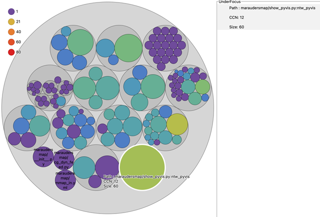
This mental map can be misleading. For example, all the code of file1 can make multiple calls to code stored in file2, with file1 and file2 at the same level and no clues on the names. This relation is invisible if the authors overlooked this.
Luckily, we have callgraphs to show the relations, even if authors hide them.
The Global Callgraph – Actual Relations in the Code
A callgraph represents the calling relationships between subroutines. It focuses on the blocks of code and their dependencies.
In contrast to the treegraph, a callgraph ignores the names and the storage strategies. Actually, it would yield the very same output even if all the routines were stored in a unique file, and were named #0001, #0002, #0003.
We keep routines as circles proportional to their size. Instead of being circular-packed, circles are linked where a routine calls another one. In graph theory, this is called a directed graph. Finally, the disposition of nodes can be computed with various approximations of the n-body problem like the Barnes-Hut simulation.
Legacy HPC software can be really complex. The network visualisation we get from a raw callgraph is often way too entangled to be useful. For example, a small “clean exit” function named print_error_and_quit can be called from dozens of places. Such a hyperconnected node makes literal “knots”. Other functions are not used anymore, and some parts are just plain not interesting.
Anyway, once the low-interest parts are filtered out and the main groups are correctly coloured, the output becomes a pretty decent map.
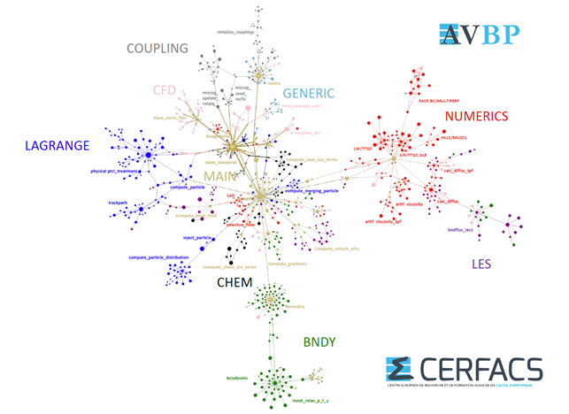
Of course, the big picture is nice for beginners, but there is more to it. It’s possible to change of scale and search for more specific and expert information. The impressive ability of the human eye to detect curious patterns comes in handy. Out of the geometrical shapes in a callgraph, one can get interesting information.
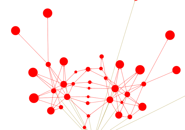
In this image, “The red crab constellation” depicts the duplication of a group of routines. The numerical scheme on fixed grids (on the right) was duplicated into another cluster of routines for mobile grids (on the left). Both, albeit not identical, call the same six final functions, aligning them into a nice symmetry axis.
Some historical features, like a former riverbed, show up on real maps. Likewise, some of the history of a code will leak on the callgraph.
Take away
- Studying software’s geography can be extremely useful: it saves time and energy reading the code, is good for development teams tracking down complexity, code size, and dependencies.
- CERFACS is developing within EXCELLERAT P2 “The Marauder’s Map”, an open source automated solution to overcome the challenges of creating usable maps.